IN THIS ARTICLE
Create a Custom Tool Gem in C++ to Extend Open 3D Engine Editor
In this tutorial, you’ll learn how to extend the Open 3D Engine (O3DE) Editor using the CppToolGem template to create a custom tool Gem called MyShapeExample. This custom tool allows you to create entities with a Shape component and configure their component properties. The Gem is written in C++ with
Qt , the O3DE Tools UI API, and other O3DE APIs.
The ShapeExample Gem, a sample Gem in the
o3de/sample-code-gems repository , demonstrates the finished Gem that you create in this tutorial. You can reference the ShapeExample Gem sample as you follow along this tutorial.
By the end of this tutorial, you’ll be able to extend the Editor by creating your own custom tools written in C++.
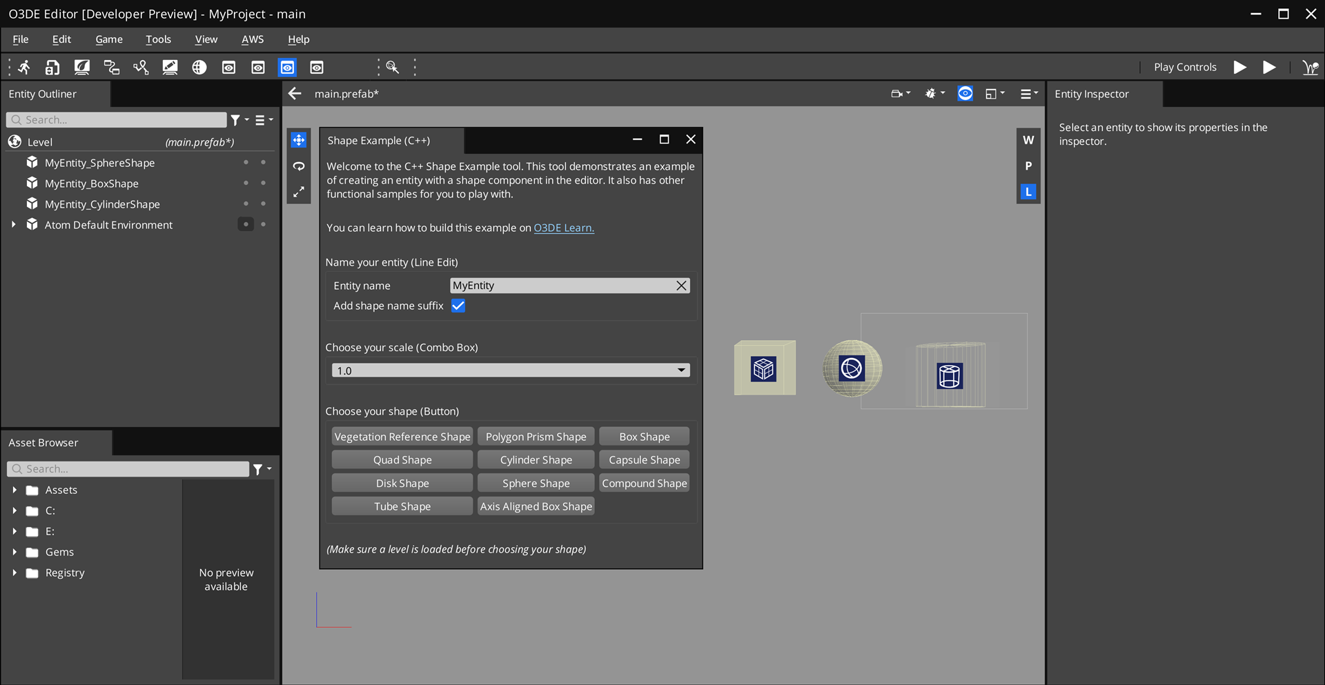
The following image is a preview of the custom tool that you create.
Prerequisites
Before you start the tutorial, ensure that you have the following:
- Set up an O3DE development environment. For instructions, refer to Set up Open 3D Engine.
Tutorial specifics
This tutorial uses the following Windows directory names and locations in the examples. You may choose different folder names and locations on your disk.
O3DE engine directory:
C:\o3de
The source directory that contains the engine.CppToolGemtemplate:C:\o3de\Templates\CppToolGem
The Gem template that your custom Gem is based off of.MyCppShapeExample Gem:
C:\o3de-gems\MyCppShapeExample
Your custom Gem. You may choose a different folder name and location in your disk.
Create a Gem from the CppToolGem template
Start by creating a Gem from the CppToolGem template, which contains a basic C++ framework to create a dockable tool (widget) in the Editor.
To create a Gem from the CppToolGem template, complete the following steps:
Create a Gem by using the O3DE CLI (
o3de) script that’s in your engine directory.scripts\o3de create-gem --gem-name MyCppShapeExample --template-name CppToolGem --gem-path C:\o3de-gems\MyCppShapeExampleThis command specifies the following options:
--gem-name,-gn: The name of the new Gem.--gem-path,-gp: The path to create the new Gem at.--template-name,-tn: The path to the template that you want to create the new Gem from.
This Gem is based off of the
CppToolGemtemplate. In this example, name the GemMyCppShapeExampleand create it inC:\o3de-gems\MyCppShapeExample.Depending on the Gem path, this command automatically registers the Gem to one of the manifest files:
.o3de\o3de_manifest.json,<engine>\engine.json, and<project>\project.json.(Optional) Register the Gem to your project. This step is optional because when you create a Gem using the O3DE CLI in the previous step, it automatically registers the Gem. If you downloaded the ShapeExample Gem from the sample code Gems repository, you must register it to your project.
scripts\o3de register -gp C:\o3de-gems\MyCppShapeExample -espp <project-path>Add the Gem in your project.
scripts\o3de enable-gem -gn MyCppShapeExample -pp <project-path>Or, enable the Gem using the Project Manager (refer to Adding and Removing Gems in a Project).
Build the project by using the O3DE CLI (refer to Build a project). Or, use the Project Manager (refer to the Build action in the Project Manager) page.
Open your project in the Editor.
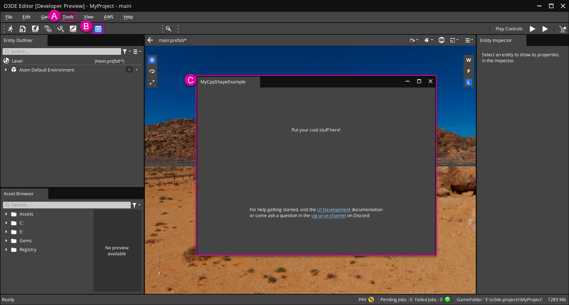
Open the tool by selecting Tools > Examples > MyCppShapeExample from the file menu. (See A in the following image.)
Or, open the tool directly by clicking on the tool’s icon in the Edit Mode Toolbar. (See B.)
Now you can access the Shape Example tool! By default, this tool contains a simple user interface (UI). In the next steps, we’ll design the tool’s UI and code its functionality. (See C.)
Code directory
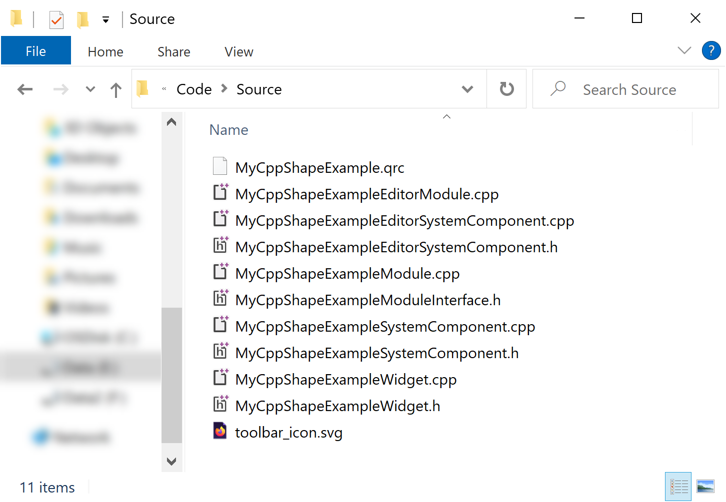
This sections describes your MyCppShapeExample Gem’s code structure. It’s important to become familiar with your Gem’s code structure because this is the entry point where you will program your tool’s custom functionality. In this example, your Gem’s directory is located at: C:\o3de-gems\MyCppShapeExample. This is the path that you specified when you created the Gem. Your Gem’s code is located in the subdirectory Code\Source, which contains the following classes and frameworks that make up your custom tool.
Example of Code\Source directory:
Modules and system components
All Gems have modules and system component classes written in C++ that connect the tool to O3DE and allow it to communicate with other systems. The CppToolGem template already contains all of the code needed to run the tool in the Editor. You can find these C++ files in Code\Source.
For more information on Gem modules and system components, refer to the Overview of the Open 3D Engine Gem Module system page.
O3DE and Qt frameworks
O3DE extends the Qt framework, so you will use Qt Widgets Module to create a graphical user interface (GUI). You will also use O3DE’s EBuses to communicate with other O3DE interfaces, such as entities and components, and connect them to Qt elements.
You will write most of your tool’s functionality and UI elements in the ShapeExample class that’s located in Code\Source\ShapeExampleWidget.h and Code\Source\ShapeExampleWidget.cpp.
Qt Resources
The
Qt Resource System allows Gems to store and load image files via a .qrc file. This eliminates the need to load image files from absolute paths, making it simpler for you to distribute your Gem. Later, you will store an image file to create an icon for your tool.
Dependent modules
Import the following dependent modules in the Code\Source\ShapeExampleWidget.cpp file. The ShapeExample class that you will create uses objects from these modules.
#include <AzCore/Component/TransformBus.h>
#include <AzCore/Utils/Utils.h>
#include <AzToolsFramework/API/EntityCompositionRequestBus.h>
#include <AzToolsFramework/Component/EditorComponentAPIBus.h>
#include <AzToolsFramework/Entity/EditorEntityAPIBus.h>
#include <QComboBox>
#include <QDoubleValidator>
#include <QFormLayout>
#include <QGridLayout>
#include <QGroupBox>
#include <QLabel>
#include <QLineEdit>
#include <QPushButton>
#include <QVBoxLayout>
#include "ShapeExampleWidget.h"
Widgets and layouts
With Qt, you can create widgets, which are containers for UI elements, and layouts which define how those UI elements are arranged. Your custom tool is a main widget that contains sub-widgets of UI elements. Each widget can have its own layout. The nested widget and layout structure allows you to organize groups of UI elements.
The ShapeExampleWidget class inherits from QWidget, which creates the main widget. The following instructions walk you through how to set up the main widget’s layout. Be aware that some of the instructions may already be done by the CppToolGem template.
At the top of your constructor, instantiate a
QVBoxLayoutcalledmainLayout.Later, you will create various UI elements and add them to
mainLayout.We recommend that you add a stretch at the bottom of
mainLayoutby usingaddStretch(). This fills any expanded space when you resize the window.Finally, set
mainLayoutto be the layout for this widget by usingsetLayout(...).
ShapeExampleWidget::ShapeExampleWidget(QWidget* parent)
    : QWidget(parent)
{

    QVBoxLayout* mainLayout = new QVBoxLayout(this);        // 1

    // ...                                                  // 2

    mainLayout->addStretch();                               // 3

    setLayout(mainLayout);                                  // 4
}
Input fields and checkboxes
In this step, create an input field for the entity’s name and a checkbox for an option to append a suffix—the component’s name—to the entity’s name. For example, suppose you set the entity’s name to “MyEntity” and enable the checkbox. Then, when you create an entity with a Box Shape component and another with a Sphere Shape component, they will respectively be named “MyEntity_BoxShape” and “MyEntity_SphereShape”.
By the end of this step, your input field and checkbox should look like this:

After instantiating mainLayout, wrap the input field and checkbox in their own sub-widget, set the layout, and add it to the main widget.
To start, instantiate a
QGroupBoxcalledentityNameWidgetand aQFormLayoutcalledformLayout.Later, you will create the input field and checkbox and add them to this widget.
Finally, set the layout of
entityNameWidgettoformLayout, and addentityNameWidgettomainLayout.
    QGroupBox* entityNameWidget = new QGroupBox(this);  // 1
    QFormLayout* formLayout = new QFormLayout();

    // ...                                              // 2

    entityNameWidget->setLayout(formLayout);            // 3
    mainLayout->addWidget(entityNameWidget);
Create an input field
An input field is a UI element that takes text input from the user. With Qt, you can create an input field by using the QLineEdit object.
In ShapeExampleWidget.h, create a private QLineEdit* variable. In this example, name it m_nameInput.
    private:
        QLineEdit* m_nameInput = nullptr;
        //...
In ShapeExampleWidget.cpp, do the following:
Create an input field by instantiating
QLineEditand assigning it tom_nameInput.Set the placeholder text in
m_nameInputby callingsetPlaceholderText(...).Enable a button to clear the text using
setClearButtonEnabled(true).
    m_nameInput = new QLineEdit(this);
    m_nameInput->setPlaceholderText(QObject::tr("Set custom Entity name here..."));
    m_nameInput->setClearButtonEnabled(true);
Create a checkbox
A checkbox is an option button that users can enable or disable to trigger a user-defined behavior. With Qt, you can create an checkbox by using the QCheckBox object. In this example, the checkbox controls whether or not to append a suffix to the entity’s name. At runtime, it will start disabled, and enable when the user enters the entity’s name to the input field. You will define this behavior later.
In ShapeExampleWidget.h, create a private QCheckBox* variable. In this example, name it m_addShapeNameSuffix.
    private:
        //...
        QCheckBox* m_addShapeNameSuffix = nullptr;
        //...
In ShapeExampleWidget.cpp, do the following:
Create a checkbox by instantiating
QCheckBoxand assigning it tom_addShapeNameSuffix.Set the checkbox to start in the disabled state by using
setDisabled(true).
    m_addShapeNameSuffix = new QCheckBox(this);
    m_addShapeNameSuffix->setDisabled(true);
Add a signal listener with a slot handler
Qt uses signals and slots to communicate between objects (refer to Signals & Slots in the Qt Documentation). Set up a signal listener such that when the user enters text into the input field at runtime, the checkbox automatically enables.
In this example, the signal listener uses a slot handler, which is essentially a C++ function that a signal can connect to.
Declare a slot in
Code\Source\ShapeExampleWidget.hby using theQ_SLOTSmacro.private Q_SLOTS: void OnNameInputTextChanged(const QString& text);Call
QObject::connect(...)to create a connection between the input field (m_nameInput) to the signal (QLineEdit::textChanged) and slot (ShapeExampleWidget::OnNameInputTextChanged). Refer to the following line ofShapeExampleWidget.cpp.QObject::connect(m_nameInput, &QLineEdit::textChanged, this, &ShapeExampleWidget::OnNameInputTextChanged);Define
OnNameInputTextChanged(...)inShapeExampleWidget.cpp. This function checks ifm_nameInputcontains text, and if so, enablesm_addShapeNameSuffix.void ShapeExampleWidget::OnNameInputTextChanged(const QString& text) { m_addShapeNameSuffix->setEnabled(!text.isEmpty()); }
Add UI elements to layout
After creating the UI elements—an input field and a checkbox—and connecting a signal listener to them, add them to the layout. To ensure they belong to the sub-widget entityNameWidget, add them to the corresponding layout, formLayout, by using addRow(...).
    formLayout->addRow(QObject::tr("Entity name"), m_nameInput);
    formLayout->addRow(QObject::tr("Add shape name suffix"), m_addShapeNameSuffix);
Comboboxes
In this step, you will create a combobox that contains a list of values that you can use to scale the size of the entity.
By the end of this step, your combobox should look like this:

First, wrap the combobox in its own sub-widget, set the sub-widget’s layout, and add it to the main widget.
To start, instantiate a
QGroupBoxcalledcomboBoxGroupand aQVBoxLayoutcalledcomboBoxLayout.Later, you will create a combobox and define a list of scale values.
Finally, set the layout of
comboBoxGrouptocomboBoxLayout, and addcomboBoxGrouptomainLayout.
    QGroupBox* comboBoxGroup = new QGroupBox("Choose your scale (combobox)", this);    // 1
    QVBoxLayout* comboBoxLayout = new QVBoxLayout();

    // ...                                                                              // 2


    comboBoxGroup->setLayout(comboBoxLayout);                                           // 3
    mainLayout->addWidget(comboBoxGroup);
Create a combobox
A combobox allows users to select an item from a pop up list of items. With Qt, you can create an input field by using the QComboBox object.
In ShapeExampleWidget.h, create a private QComboBox* variable. In this example, name it m_scaleInput.
    private:
        //...
        QComboBox* m_scaleInput = nullptr;
In ShapeExampleWidget.cpp, do the following:
Define a list of scale values. In this example, name it
scaleValues.Create a combobox by instantiating
QComboBox. In this example, name itm_scaleInput.Allow users to enter a custom option in the combobox by calling
setEditable(true).If a user enters a custom option, validate that the value they entered is a numerical value within a specific range and decimal place by calling
setValidator(...). In this example, set the lower bound to0.0, the upper bound to100.0, and the decimal places to3.Add the list of values to the combobox by calling
addItems(...).Add the combobox to
comboBoxLayoutby callingaddWidget(...).
    QStringList scaleValues = {                                                 // 1
        "1.0",
        "1.5",
        "2.0",
        "5.0",
        "10.0"
    };
    m_scaleInput = new QComboBox(this);                                         // 2
    m_scaleInput->setEditable(true);                                            // 3
    m_scaleInput->setValidator(new QDoubleValidator(0.0, 100.0, 3, this));      // 4
    m_scaleInput->addItems(scaleValues);                                        // 5
    comboBoxLayout->addWidget(m_scaleInput);                                    // 6
Buttons
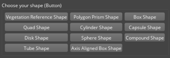
In this step, you will create a collection of buttons that create an entity with different Shape components, such as with a Box Shape, Sphere Shape, Cone Shape, and so on.
By the end of this step, your buttons should look like this:
First, wrap these UI elements in their own sub-widget, set the layout, and add it to the main widget.
To start, instantiate a
QGroupBoxcalledshapeButtonsand aQGridLayoutcalledgridLayout.Later, you will query for all types of shape components registered with the engine, add buttons to this widget, and add signal listeners to the buttons.
Finally, set the layout of
shapeButtonstogridLayout, and addshapeButtonstomainLayout.
    QGroupBox* shapeButtons = new QGroupBox(this);      // 1
    QGridLayout* gridLayout = new QGridLayout();

    // ...                                              // 2

    shapeButtons->setLayout(gridLayout);                // 3
    mainLayout->addWidget(shapeButtons);
Query Shape components
Query the types of Shape components registered with the engine. In O3DE, all components have a list of provided services that you can query from. In this example, you are looking for Shape components, which all provide “ShapeService”.
Create a
AzToolsFramework::EntityCompositionRequests::ComponentServicesListcalledprovidedServicesand add “ShapeService”.Get a list of component types. Call
AzToolsFramework::EditorComponentAPIBus::BroadcastResult(...)and dispatchAzToolsFramework::EditorComponentAPIRequests::FindComponentTypeIdsByService, which takes a list of services to include (providedServices) and services to exclude (an empty list) and stores the component types totypeIds.
    AzToolsFramework::EntityCompositionRequests::ComponentServicesList providedServices;
    providedServices.push_back(AZ_CRC_CE("ShapeService"));

    AZ::ComponentTypeList typeIds;
    AzToolsFramework::EditorComponentAPIBus::BroadcastResult(
        typeIds,
        &AzToolsFramework::EditorComponentAPIRequests::FindComponentTypeIdsByService,
        providedServices,
        AzToolsFramework::EntityCompositionRequests::ComponentServicesList()
    );
Query the names of the components to add to the buttons.
- Get a list of component names. Call
AzToolsFramework::EditorComponentAPIBus::BroadcastResult(...)and dispatchAzToolsFramework::EditorComponentAPIRequests::FindComponentTypeNames, which takes the list of component types (typeIds) and stores the corresponding component names tocomponentNames.
AZStd::vector<AZStd::string> componentNames; AzToolsFramework::EditorComponentAPIBus::BroadcastResult( componentNames, &AzToolsFramework::EditorComponentAPIRequests::FindComponentTypeNames, typeIds );- Get a list of component names. Call
Note:You can query a list of services that components provide by calling the component’sGetProvidedServices()method.
Add buttons
A button is a UI element that the user can click to trigger a user-defined behavior. With Qt, you can create a button by using the QPushButton object. In this example, when the user clicks on the button, it will create an entity with a Shape component. You will define this behavior later.
Loop through the list of component names, create buttons, and add them to the gridLayout. For each component:
Store the component’s name and type from the list of component names and types that you queried earlier. In this example, we’ll name them
nameandtypeId.Create a button by instantiating
QPushButton. In this example, name itshapeButton. Pass innameto add the component’s name onto the button.Later, you will connect
shapeButtonto a signal listener.Split
gridLayoutinto three columns, and add the button.
    const int maxColumnCount = 3;
    for (int i = 0; i < componentNames.size(); ++i)
    {
        AZStd::string name = componentNames[i];                                             // 1
        AZ::TypeId typeId = typeIds[i];

        QPushButton* shapeButton = new QPushButton(QString::fromUtf8(name.c_str()), this);  // 2

        // ...                                                                              // 3

        int row = i / maxColumnCount;                                                       // 4
        int column = i % maxColumnCount;
        gridLayout->addWidget(shapeButton, row, column);
    }
Add a signal listener with a lambda handler
Next, create a signal listener such that when the user clicks the button, an entity will be created in your scene and the corresponding Shape component will be added to that entity.
In this example, the signal listener uses a lambda handler, so you can define the C++ function without defining a slot.
Define
CreateEntityWithShapeComponentas a standard C++ function inShapeExampleWidget.h. This function accepts anAZ::TypeId&as a parameter so it can create an entity with the specified component type.private: void CreateEntityWithShapeComponent(const AZ::TypeId& typeId);In the loop that you created earlier, create a connection from the
clickedsignal in theshapeButtonto the lambda function inthis. The lambda function callsCreateEntityWithShapeComponent(...)and captures thetypeIdfor the Shape component being iterated over.QObject::connect(shapeButton, &QPushButton::clicked, this, [this, typeId]() { CreateEntityWithShapeComponent(typeId); });
Communicate with EBuses
Define CreateEntityWithShapeComponent(...), which communicates with O3DE EBuses to create a new entity with a component specified by the typeId parameter.
Send a request to create a new entity by calling
EditorRequestBus::BroadcastResult(...). Dispatch theEditorRequests::IsLevelDocumentOpenevent, which will return true/false if a level has been loaded or not.- Attempting to create an Entity without a level loaded will cause a crash, so if a level isn’t loaded, we will print a warning message and then return.
Send a request to create a new entity by calling
EditorRequestBus::BroadcastResult(...). Dispatch theEditorRequests::CreateNewEntityevent, which creates a new entity and returns itsAZ::EntityId. The new entity’sAZ::EntityIdis stored innewEntityId.If the user entered a name in the input field, update the entity’s name.
Get the name of the entity by calling
text(), and store it inentityName.If the user enabled the checkbox to apply a suffix of the component’s name to the entity’s name, query the component’s name. Call
EditorComponentAPIBus::BroadcastResult(...)and dispatch theEditorComponentAPIRequests::FindComponentTypeNamesevent, which finds the component names of the provided list and stores them incomponentNames.Format the name and suffix, if any.
Call
EditorEntityAPIBus::Event(...)and dispatchEditorEntityAPIRequests::SetNameto set the name ofnewEntityIdtoentityName.
Set the entity’s scale.
Get the value in the combobox by calling
currentText(), and store it inscale.Set the entity’s scale by calling
AZ::TransformBus::Event(). DispatchSetLocalUniformScaleto set the scale ofnewEntityId.
Add a Shape component to the entity. Call
EditorComponentAPIBus::Broadcast(...)and dispatchEditorComponentAPIRequests::AddComponentsOfType, which adds the components from the provided list tonewEntityId.
void ShapeExampleWidget::CreateEntityWithShapeComponent(const AZ::TypeId& typeId)
{
    // 1
    bool isLevelLoaded = false;
    EditorRequestBus::BroadcastResult(isLevelLoaded, &EditorRequests::IsLevelDocumentOpen);
    if (!isLevelLoaded)
    {
        AZ_Warning("ShapeExample", false, "Make sure a level is loaded before choosing your shape");
        return;
    }

    // 2
    AZ::EntityId newEntityId;
    EditorRequestBus::BroadcastResult(newEntityId, &EditorRequests::CreateNewEntity, AZ::EntityId());

    // 3
    if (!m_nameInput->text().isEmpty())
    {
        QString entityName = m_nameInput->text();

        if (m_addShapeNameSuffix->isChecked())
        {
            AZStd::vector<AZStd::string> componentNames;
            EditorComponentAPIBus::BroadcastResult(
                componentNames,
                &EditorComponentAPIRequests::FindComponentTypeNames,
                AZ::ComponentTypeList{ typeId }
            );

            AZ_Assert(componentNames.size() == 1, "Unable to find component name");

            QString shapeName(componentNames[0].c_str());
            shapeName.replace(" ", "");

            entityName = QString("%1_%2").arg(entityName).arg(shapeName);
        }

        EditorEntityAPIBus::Event(newEntityId, &EditorEntityAPIRequests::SetName, entityName.toUtf8().constData());
    }

    // 4
    bool validFloat = false;
    float scale = m_scaleInput->currentText().toFloat(&validFloat);
    if (validFloat)
    {
        AZ::TransformBus::Event(newEntityId, &AZ::TransformInterface::SetLocalUniformScale, scale);
    }

    // 5
    EditorComponentAPIBus::Broadcast(&EditorComponentAPIRequests::AddComponentsOfType, newEntityId, AZ::ComponentTypeList{ typeId });
}
Icon
An icon is an image file that’s used to represent your tool in the Editor. The icon appears in the Edit Mode Toolbar in the Editor (see the following image).
Add an icon
The following instructions walk you through how to store the icon using the Qt Resource System and load it from your Gem module. Be aware that some of the instructions may already be done by the CppToolGem template.
Add an image file to the
Code\Sourcedirectory to use as your icon. In this example, the icon is namedtoolbar.svg. We recommend that your icon adheres to the guidelines in UI development best practices.Add your icon to MyCppShapeExample Gem’s resources by updating
Code\Source\MyCppShapeExample.qrcwith your new icon’s file name.<!DOCTYPE RCC><RCC version="1.0"> <qresource prefix="/MyCppShapeExample"> <file alias="toolbar_icon.svg">toolbar_icon.svg</file> </qresource> </RCC>Register MyCppShapeExample Gem’s resources to Qt Resource System by adding the following code in
Code\Source\EditorModule.cpp.- Define the function
InitShapeExampleResources()and callQ_INIT_RESOURCE(...)to register the Qt resources listed inMyCppShapeExample.qrc.
void InitShapeExampleResources() { Q_INIT_RESOURCE(MyCppShapeExample); }- Call
InitShapeExampleResources()in theEditorModuleclass’s constructor.
- Define the function
Build and test your tool
Windows
For Windows, build and debug your custom tool using Visual Studio.
Launch Visual Studio and open the O3DE solution.
Find your Gem in the Solution Explorer. Right-click and select Build or Debug.
Open your project in the Editor and load the Gem.
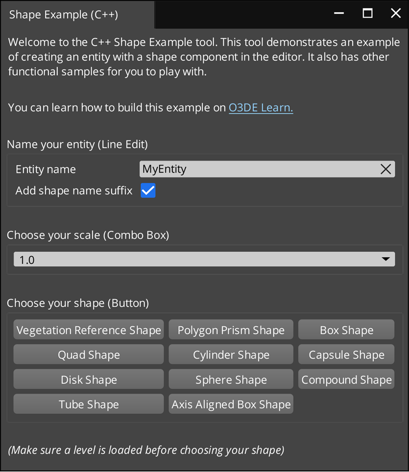
Congratulations! You created a custom tool Gem that’s written in C++, built it, and loaded it in the Editor. Your Shape Example tool should look something like this:
Download the ShapeExample Gem sample
Now that you’ve completed this tutorial, you can compare your MyCppShapeExample Gem to the sample Gem, ShapeExample Gem, in
o3de/sample-code-gems repository .
To download this sample and load it in the Editor.
Download or clone the repository. The ShapeExample Gem is located in
<repo>\sample-code-gems\cpp_gems\ShapeExample.git clone https://github.com/o3de/sample-code-gems.gitBefore you can open the Shape Example tool, do the following:
Register your Gem.
Enable it in your project.
Rebuild your project.
Open the tool in the Editor.
These steps are explained earlier in this tutorial. Refer to Create a Gem from the
CppToolGemtemplate.
