IN THIS ARTICLE
Error Messages in Inline Notifications
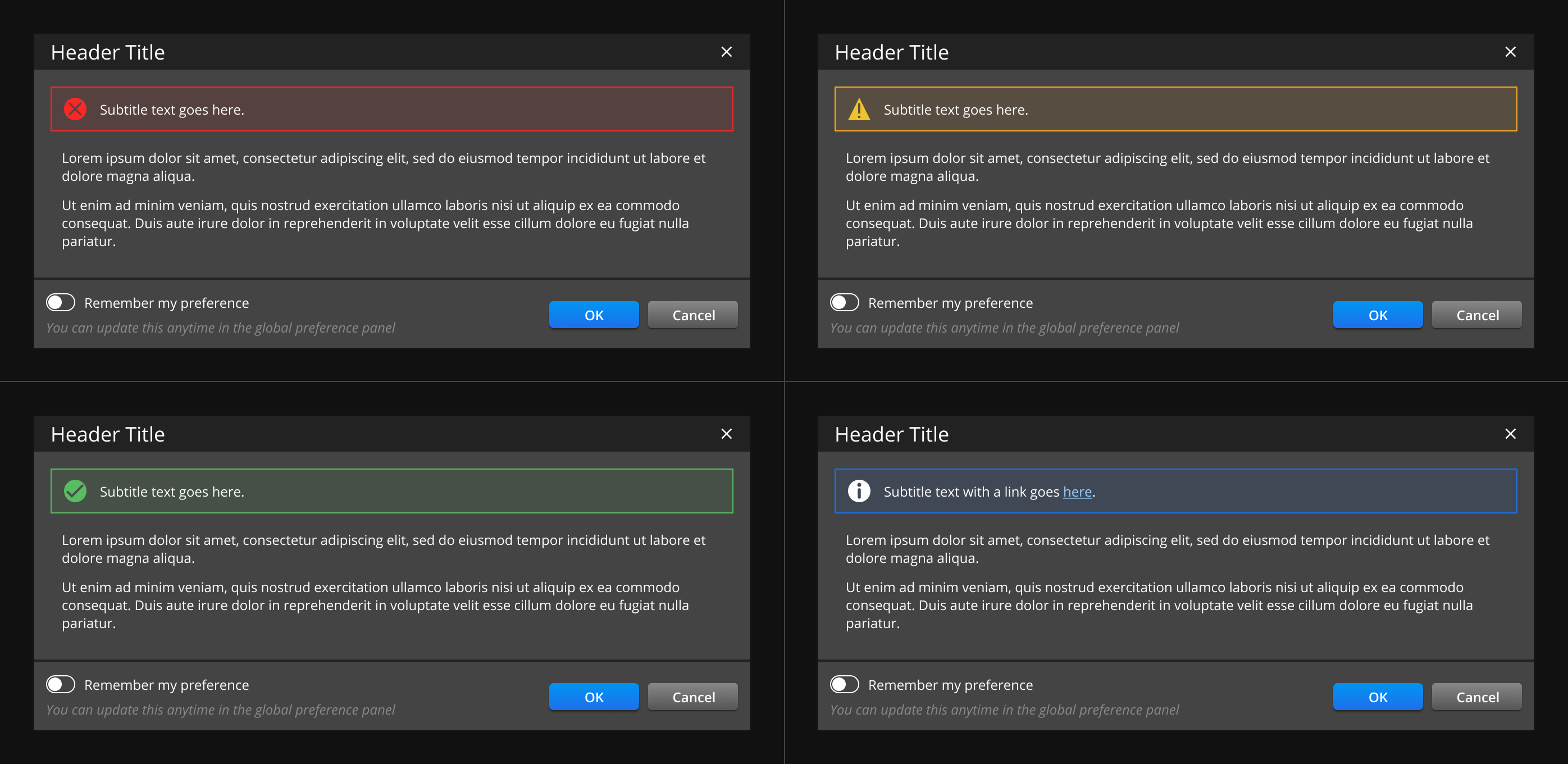
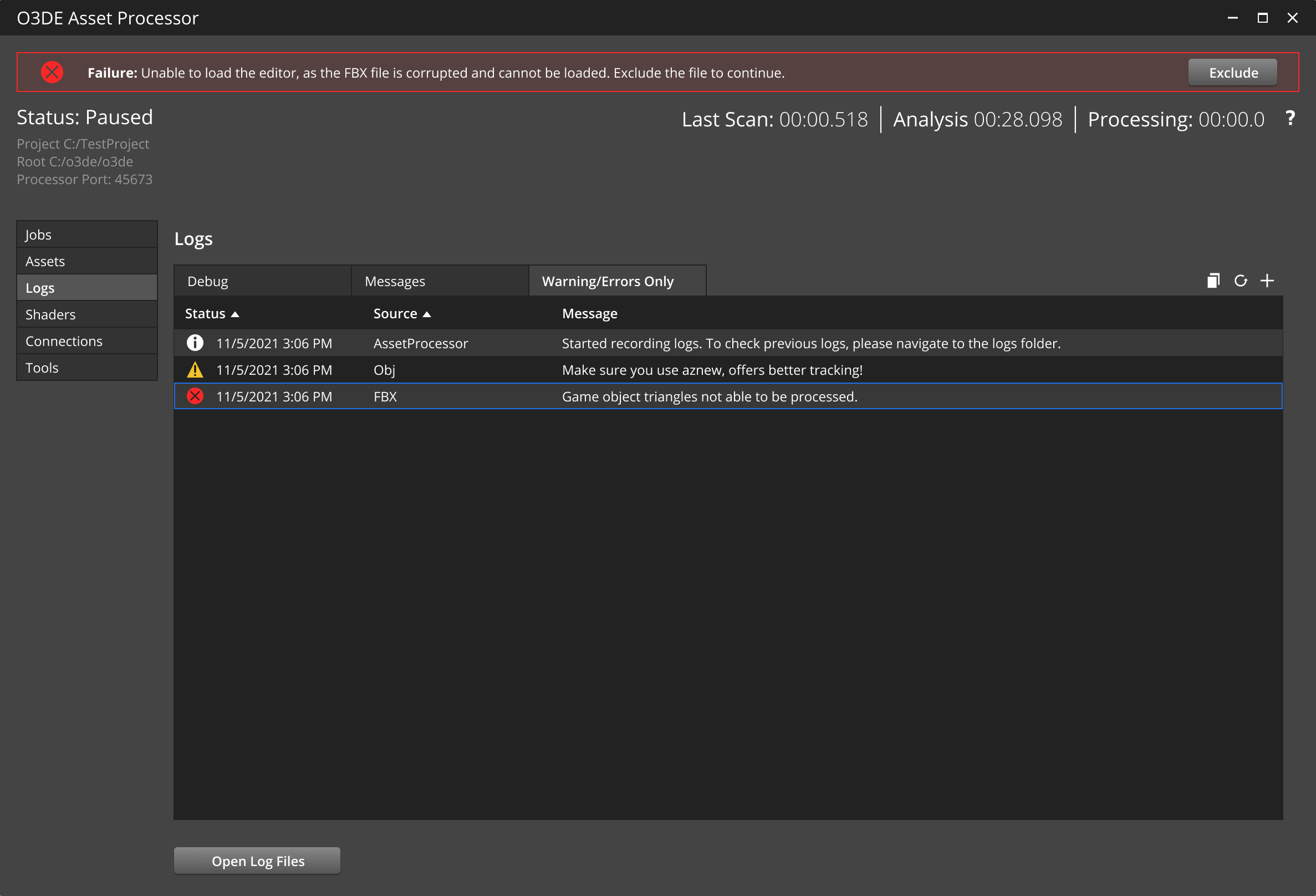
Inline notifications are non-disruptive messages that are confined to a specific area within the interface. Inline notifications are used to display immediate feedback to the user. They are frequently used as an alternative to toasts, in conjunction with log tables, and within component cards.
Specifications
Review these specifications when creating an inline notification:
Persistently display inline notifications until the user dismisses them or until the issue is resolved.
Write clear and concise messages. One line is recommended.
Initiate inline notifications in response to the user’s action during their workflow, or by the system.
Include an optional call-to-action button that’s related to the message.
- Use one of the following icons from the list of Standard icons: error/failure or warning icon.
Display inline notifications only on screens that have more than one operational purpose. For instance, they can appear within non-modal dialogs, but cannot appear inside modal dialogs.
Don’t use inline notification messages in place of a log file.
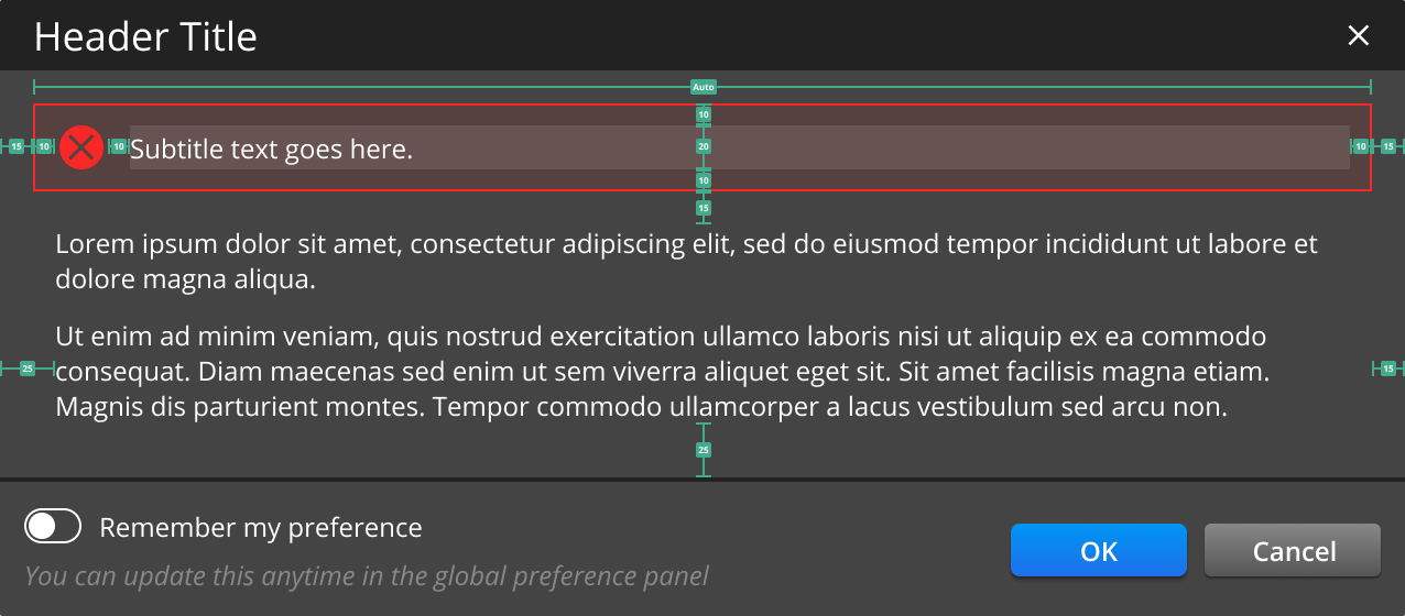
UI dimensions
| Property | Specification |
|---|---|
| Icon Size | 24 x 24px |
| Padding | 10px |
| Fill | Specific color opacity: 10% |
| Border | Specific Color |
| Font | Open Sans |
| Weight | 400 |
| Size | 12px |
| Line Height | 20px |
Best practices
Place inline notifications at the top of the content so they don’t cover any content.
Do not stack multiple inline notifications. Instead, show them one at a time, sequentially and in order of priority, without blocking any user action.
Messages must be descriptive and guide users with explicit next steps.
Use inline notifications to redirect the user’s focus from the current interface and onto the message.
Messages can include a helper link that points outside of the system and not to another part of the application.
Multiple line messages
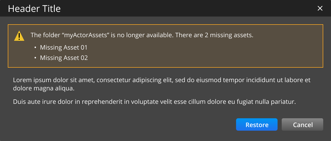
It’s recommended that inline notification messages fit on one line. However, if they fit on multiple lines, ensure the following:
- Use a bulleted list to present a list of issues. A list is helpful to draw the user’s attention to important information.
- Within the non-modal dialog, guide the user towards their next steps and on how to resolve the issue.
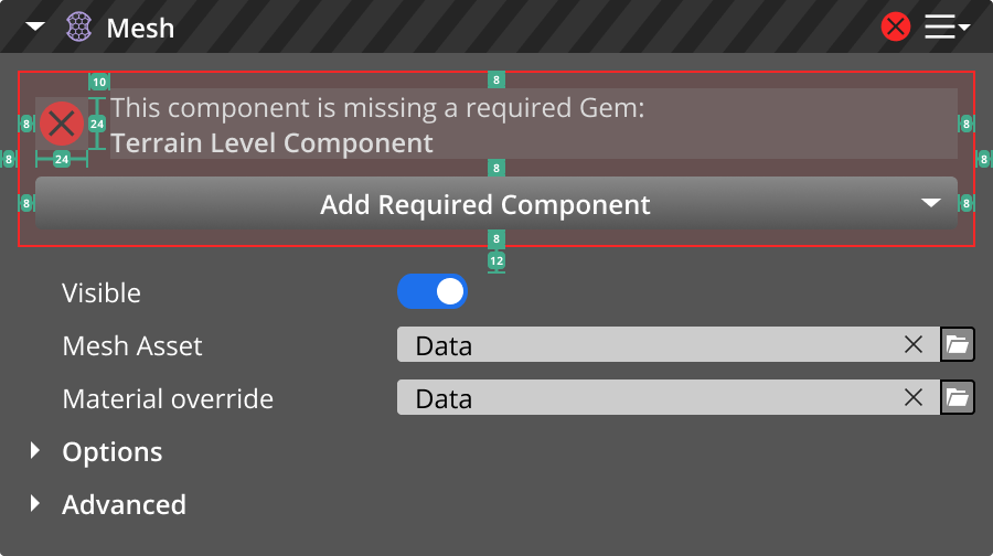
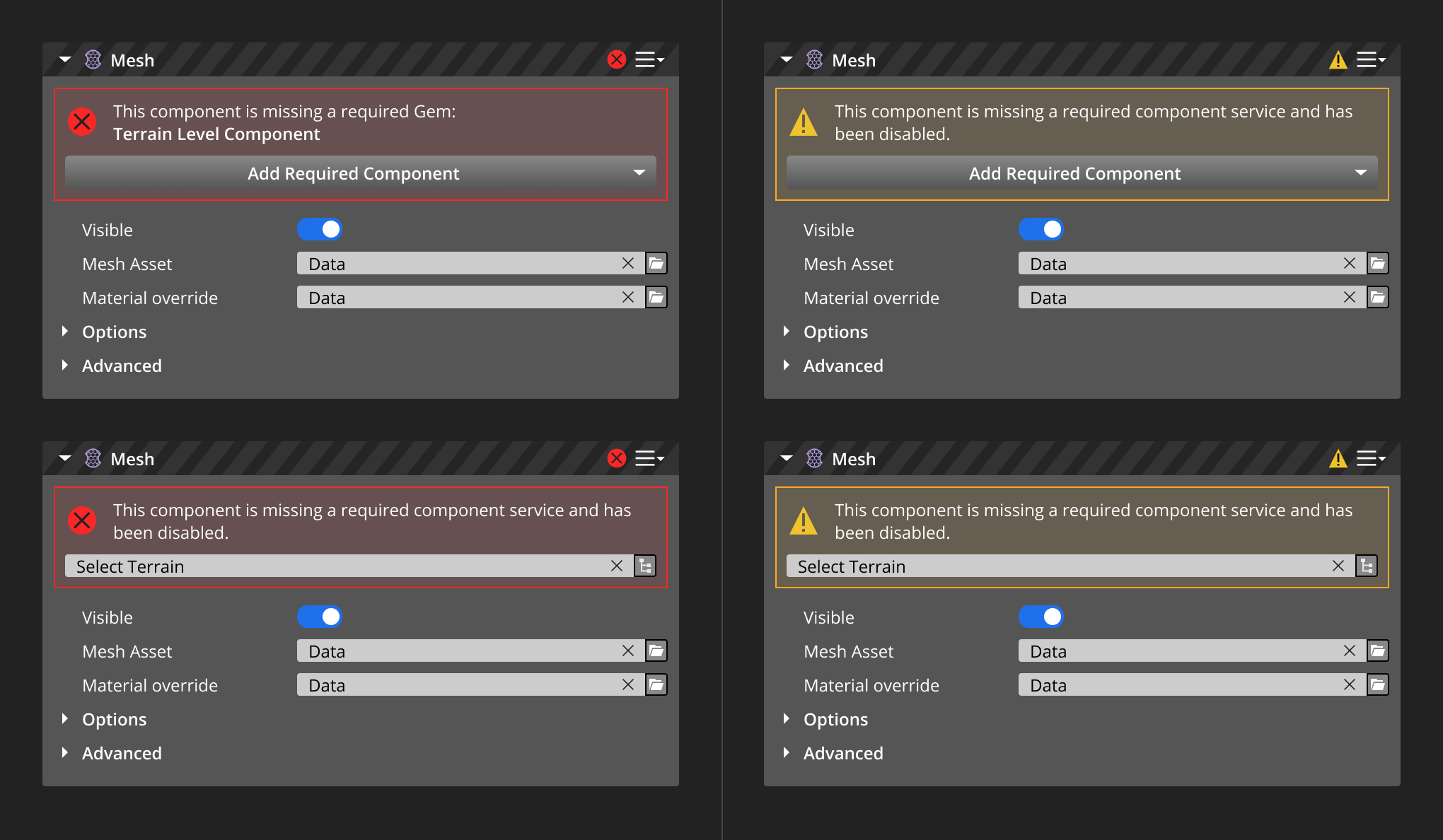
Inline notifications in component cards
Inline notifications in component cards are displayed to indicate an error/failure or warning status. Inline messages inform users on how to recover or resolve the issue.
Specifications
Persistently display inline notifications in the component cards until the issue is resolved.
Avoid stacking multiple inline messages horizontally or vertically. Instead, display the messages one after the other as the user resolves each issue.
Write clear and concise messages. A maximum of two lines is recommended.
Use the error/failure or warning icon from the list of standard icons, depending on the following use cases. Refer to Standard Icons.

Include a call-to-action button only when necessary.
Display the inline notification above the component card’s content.
The component card’s header has a gray caution pattern background and displays the icon. This indicates the status of the component card even when it’s collapsed.
UI dimensions
| Property | Specification |
|---|---|
| Icon size | 24 x 24px |
| Padding | 8px |
| Fill | Warning color opacity: 10% |
| Border | Warning color code |
| Font | Open Sans |
| Weight | 400 or 600 |
| Size | 12px |
| Line weight | 16px |
