IN THIS ARTICLE
Error Messages in Text Input Validation
Text input validation is the process in which a system checks if the user provides the correct information. For invalid text, effective notification messages help the user understand the issue and how to resolve it.
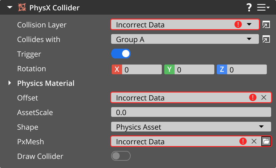
The system validates text inputs and displays a notification only after the user interacts with the input field. If they input incorrect data, inform the user on what has happened by displaying the appropriate icon by the input field. You can also provide further information in a tooltip, which appears when the user hovers over the input field.
Example

Error/failure icon

Use this icon to represent an error or failure within a text input validation message. You may exclude this icon for smaller input fields that don’t have space icons. The error/failure icon for text input validation differs from the standard error/failure icon to avoid confusion when both icons are used.
Tooltips
For text input validation, tooltips appear when users hover over the icon or input field. In this case, a tooltip contains information to help users resolve invalid input fields.
Specifications
Review these specifications when creating a tooltip for text input validation:
Display the tooltip only when the user hovers over the icon and input field, not any other UI element.
Write the tooltip message in plain text. Don’t include rich information, such as images and formatted text.
Display the tooltip as long as the user hovers over the element.

