IN THIS ARTICLE
Error Messages in Toasts
In O3DE, toasts are non-disruptive notifications that are displayed over most elements in a page on the bottom-right corner of the window. They are non-distruptive because they can be displayed in the middle of a user’s workflow without hindering the user’s actions.
The following example demonstrates a toast that appears at the bottom-right corner of the O3DE Animation Editor window.
Using standard icons
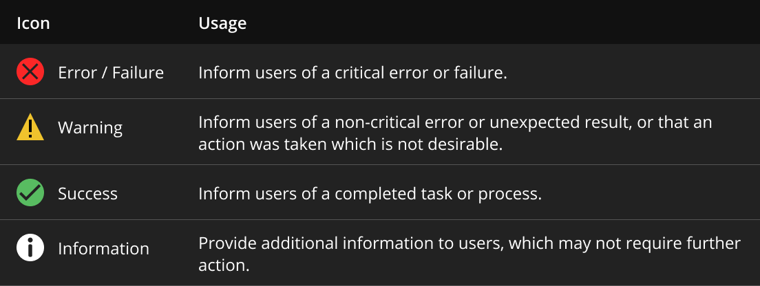
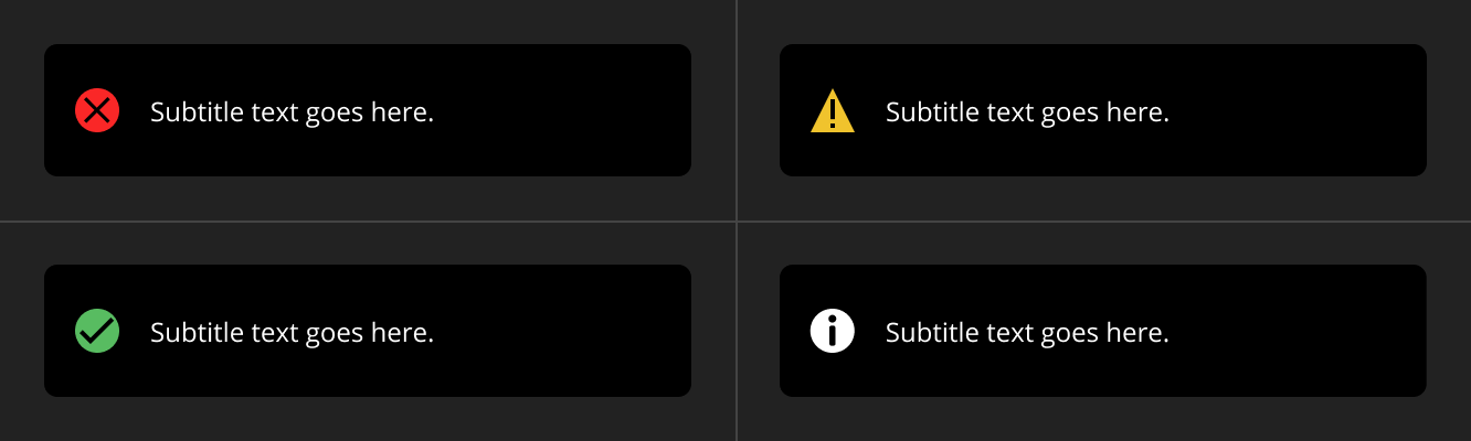
Toasts convey the message’s intent and must correspond with an appropriate icon to provide a consistent experience for the users. The following image shows toasts of different message intents: error/failure, warning, success, and information.
Refer to the following table to determine what icon to use in your toast, depending on the message’s use case.
Example
Specifications
Review these specifications when creating a toast:
Toasts are passive and non-disruptive messages. They shouldn’t hinder the user’s workflow.
Write clear and concise messages. Toasts can show only up to two lines.
Toasts must disappear after three seconds (or a maximum of five seconds). An exception is if the message includes a link that requires the user to take action for the toast to disappear.
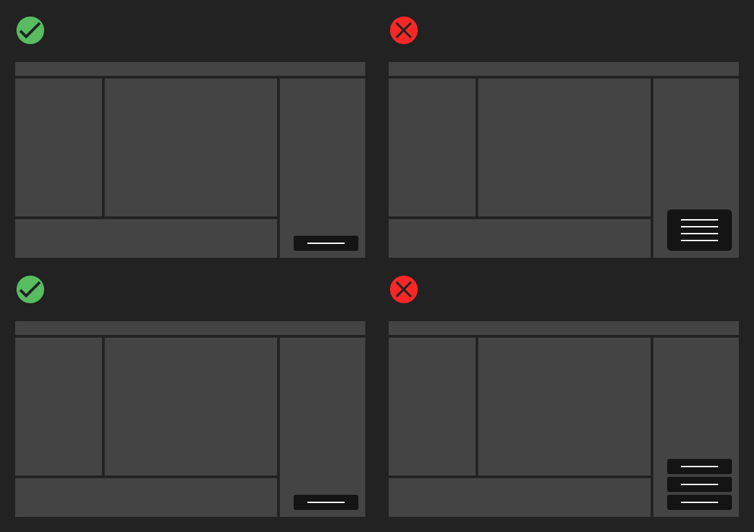
Don’t stack multiple toasts such that they are side-by-side vertically or horizontally, as this may block the user’s workflow. Instead, display multiple toasts sequentially and in order of importance.
Use one of the following icons from the list of Standard icons: error/failure, warning, success, or information icon.
The toast must have a fixed width and should not expand to fit the content area.
Toasts cannot contain a call-to-action button.
Toasts must appear above page content and on a screen where overlay layers are appropriate.
Toasts must not be used within a modal. Consider using them within larger systems like O3DE Editor, Material Editor, Viewport, and so on.
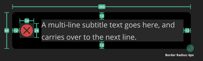
UI dimensions
| Property | Specification |
|---|---|
| Icon Size | 24 x 24px |
| Padding | 12px |
| Border Radius | 6px |
| Font | Open Sans |
| Weight | 400 |
| Line Height | 16px |
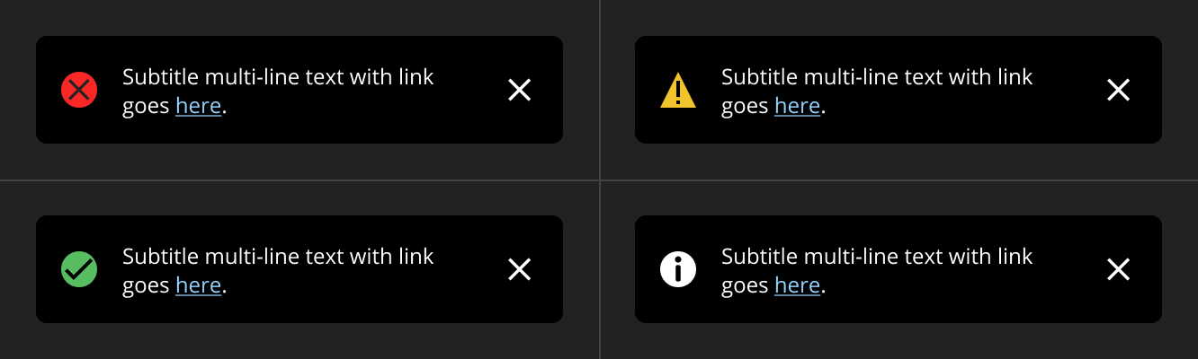
Toasts with links
Toasts that contain links in the subtitle text must do the following:
Persistently display and don’t automatically disappear, unlike a standard toast.
Display a manual close button.
Point outside the system, not to another part of the application as this might disrupt the user’s workflow. For example, you can link to an external web address: “Check out tutorials on how to create a material here, <link>.”