UI Scrollbar Component
You can use a ScrollBar component to add a scrollable bar, or handle, for manipulating settings or scrolling within a scroll box.
To see in-game examples of completed canvases with the ScrollBar component, open the level UiFeatures in the project SamplesProject. Press Ctrl+G to play the game, and then choose Components, Interactable Components, ScrollBar. You can view examples of different types of scroll bar positioning and handles, scroll bars paired with scroll boxes, and visibility options. Press Esc to exit the game.
To view these same canvases in the UI Editor, navigate to the \Gems\LyShineExamples\Assets\UI\Canvases\LyShineExamples\Comp\ScrollBar directory. You can open the following canvases:
ScrollBoxes.uicanvas- Examples of scroll bars paired with scroll boxesSimple.uicanvas- Examples of scroll bar with simple logicVisibility.uicanvas- Examples of scroll bar visibility options when paired with scroll boxes
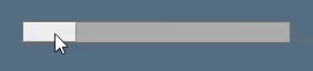
This is a horizontal scroll bar:
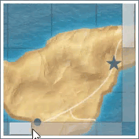
This is an image within a scroll box with both a horizontal and a vertical scroll bar:
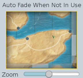
The scroll bar can also fade automatically when not in use:
You can add a prefabricated horizontal or vertical scroll bar element. When you do this, a handle is automatically created and nested in your Hierarchy pane.
You can add a prebuilt ScrollBarHorizontal or ScrollBarVertical element from the slice library. When you do this, the scroll bar and its handle is automatically created in your Hierarchy pane.
To add a ScrollBar element from the slice library
- In the UI Editor, choose New, Element from Slice Library, ScrollBarHorizontal or ScrollBarVertical.
To edit a scroll bar component
In the Properties pane of the UI Editor, expand ScrollBar and do the following, as appropriate:
Interactable
See Properties to edit the common interactive component settings.
Elements, Handle
Select an element from the list to provide the movable handle of the scroll bar.
Values, Orientation
Select the scroll bar’s orientation: + Horizontal - Scrollbar’s handle moves left and right. + Vertical - Scrollbar’s handle moves up and down. Values, Value
Enter the initial value of the scroll bar (0.0 to 1.0).
Values, Handle size
Enter the size of the handle relative to the scroll bar (0.0 to 1.0).
Values, Min handle size
Enter the minimum size of the handle in pixels.
Actions, Change
Enter a text string. This string is sent as an action on the UI canvas when the scroll bar changes values.
Actions, End Change
Enter a text string. This string is sent as an action on the UI canvas when the scroll bar has finished changing values.
Fade, Auto Fade When Not In Use
Select the check box to enable the scrollbar to fade to transparency after it is not used for a set amount of time. Specify the delay time in Fade Delay.
Fade, Fade Delay
Enter the delay in seconds before the scrollbar begins fading to transparency. Requires Auto Fade When Not In Use to be checked.
Fade, Fade Speed
Enter the time in seconds that it will take for the scrollbar to completely fade to transparency. Requires Auto Fade When Not In Use to be checked.