Interactive Component Properties
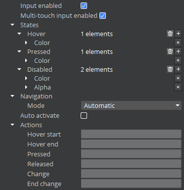
All of the interactive components share a common set of properties. These properties are grouped into the following categories:
- Input Enabled - Check box or flag that determines whether the element can be interacted with.
- Multi-Touch Input Enabled - Check box or flag that determines whether the element will handle multi-touch events. Requires multi-touch to be enabled on the parent UI canvas (enabled by default).
- States - Settings that determine the appearance of the element when in the Hover, Pressed, or Disabled states.
- Navigation - Settings that determine how the gamepad or arrow keys navigate between interactive elements.
- Auto Activate - Check box or flag that determines whether the element is automatically activated when the player pauses on the element.
- Actions - Events that are caused by the listed action.

