States
The States group of properties defines the appearance of the interactive element and its child UI elements when the element is in the Hover, Pressed, and Disabled states.
The normal appearance of a visual element (defined as an element with a visual component, such as image or text) is defined by the properties of that visual component. Some of the visual component’s properties, however, can be overridden by an interactive component that is in the Hover, Pressed, and Disabled states.
The Hover, Pressed, and Disabled states have a list of state actions, which define the appearance of that state, and which override the corresponding property of the visual component:
- Color - RGB color tint
- Alpha - Opacity
- Sprite - Texture
- Font - Text font and font effect (of a text component, for example)
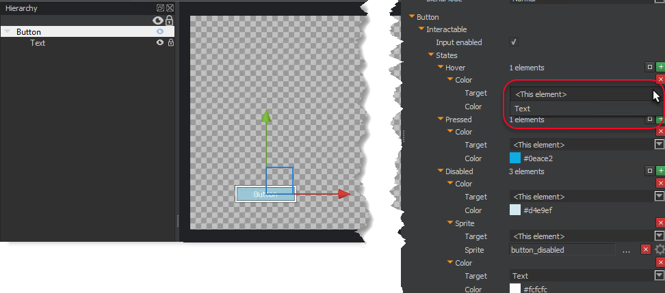
The state actions-Color, Alpha, Sprite, and Font-each have a Target property that specifies which visual element is to be affected. The elements from which you can choose include the current element-listed as
For example, the button UI component has a top element named Button that has a visual component to define its color. It also has a child element with a text component to define the text (and its color) of the button. The top element (Button) also has the Interactable component. The Target for the color state action can override either the Button element’s color or the Text element’s color, depending on what you select from the list.
When you first add an interactive component to an element, no state actions are added by default. You must add state actions to the states that you want to use and modify.
To add a state action to a state
In the UI Editor, in the Properties pane, under the interactive component’s name (for example, Button), do the following:
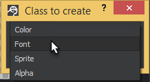
Under Interactable, States, click Add new element (green +).
From the list, choose one of the following: Color, Font, Sprite, Alpha.
To delete a state action
- Click Remove element (red x) next to the state action that you want to delete.
To clear all state actions from a state
- Click Clear container (box icon) next to the state from which you want to clear all the state actions.