IN THIS ARTICLE
UI Transform2D Component
The Transform2D component is automatically added to every UI element you create. This component defines the element’s position, rotation, size, and scale relative to its parent’s edges. The parent may be another element (if the elements are nested), or the canvas.
Managing UI Anchors and Offsets
You can use anchors and offset settings in the Transform2D component to set a UI element’s position and size relative to its parent’s edges. The Transform2D component is a required component in every element.
Anchor values are always 0.00% to 100.00% as defined by the parent’s edges. Offsets are expressed in pixels and are relative to the anchors.
Anchors and offsets are useful in a variety of situations:
- Ensuring that an element maintains a specific padding within its parent’s edges, regardless of changes to the parent’s size
- Anchoring an element to a corner of its parent, regardless of changes to the parent’s size or position
- Building resolution-independent UI elements
For example, you can ensure an element remains full screen regardless of the screen’s resolution.
Configuring an element’s anchors
In the Hierarchy pane of the UI Editor, select the element whose anchors you want to modify.
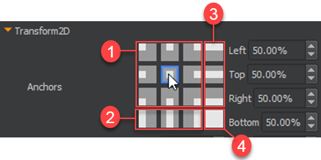
In the Properties pane, under Transform2D, choose from the selection of commonly used anchor placements.
Anchor to the parent’s center, corner, or midway along an edge without changing size.
Anchor to the left edge, middle, or right edge; vertical size adjusts to parent.
Anchor to the top edge, middle, or bottom edge; horizontal size adjusts to parent.
Anchor all of the element’s edges to the parent. The horizontal and vertical size adjusts to parent. You can use this anchor preset to place an element that remains full screen, regardless of a change in resolution. This applies if the canvas is its parent.
To further edit (fine tune) an element’s anchors In the Properties pane, under Transform2D, do the following for Anchors, as appropriate:
- For Left, enter a value between
0.00%and100.00%. - For Right, enter a value between
0.00%and100.00%. - For Top, enter a value between
0.00%and100.00%. - For Bottom, enter a value between
0.00%and100.00%.
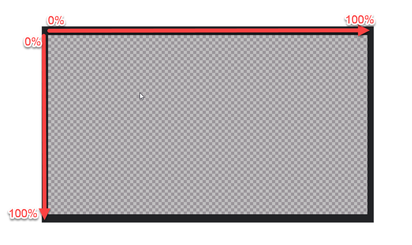
The anchors’ positions can be visualized as points on a grid, plotted in percentages by the length of its parent’s edges from left to right and top to bottom. If you want to keep the element’s size absolute (so that it doesn’t change size when the parent changes size) but want to anchor it a particular vertical or horizontal point relative to the parent’s size, make sure the top and bottom (or left and right) anchors have the same number. In this case, the anchors are said to be together.
But if, for example, you want the element’s left and right edges to each remain at a fixed percentage relative to its parent and to change size as its parent changes size, then make the numbers different. In this case, the anchors are called split.
Editing an element’s position and size
In the Properties pane, under Transform2D, modify the Offsets, as appropriate: If the element’s anchors are together, do the following:
- For X Pos, enter a negative or positive value in pixels. This adjusts the horizontal offset relative to the left-right anchor position.
- For Y Pos, enter a negative or positive value in pixels. This adjusts the vertical offset relative to the top-bottom anchor position. When the element’s anchors are together, only its position adjusts with the parent’s size. The element’s size is not adjusted. Therefore, you can manually adjust the element’s size, which remains consistent when anchors are together.
- For Width, enter a value in pixels.
- For Height, enter a value in pixels. If the element’s anchors are split, do the following:
- For Left, enter a negative or positive value in pixels. This adjusts the size offset relative to the element’s left anchor.
- For Right, enter a negative or positive value in pixels. This adjusts the size offset relative to the element’s right anchor.
- For Top, enter a negative or positive value in pixels. This adjusts the size offset relative to the element’s top anchor.
- For Bottom, enter a negative or positive value in pixels. This adjusts the size offset relative to the element’s bottom anchor.
Editing an element’s pivot, rotation, and scale
In the Properties pane, under Transform2D, do the following for Pivot, Rotation, and Scale, as appropriate:
- For Pivot, select a pivot preset or enter values for X and Y where
0and1represent the element’s edges. - For Rotation, enter a value in degrees.
- For X Scale, enter a value to use as a multiplier for the element’s width.
- For Y Scale, enter a value to use as a multiplier for the element’s height.
- Select Scale to Device if you want the UI element and its child elements to scale with the device resolution.
Note:The element rotates around, resizes from, and calculates position from its pivot point. The pivot point is not limited by the element’s borders. You can place the pivot outside of the element.
Example: Using Anchors to Resize an Element Relative to its Parent In the following example, anchors are used to resize the element relative to its parent. The layout column of buttons is resized as needed to stay on the screen. Because the layout column of buttons does not use the Scale to Device setting, the button text does not change size along with its parent button.
Note:You can configure the text element separately.
The layout column of buttons has the following settings.
Layout Column element settings
| Property | Values |
|---|---|
| Anchors | Left = 20%, Top = 6%, Right = 80%, Bottom = 94% |
| Pivot | Default settings: X = 0.5, Y = 0.5 |
| Scale to device | None (not selected) |
Scale to Device
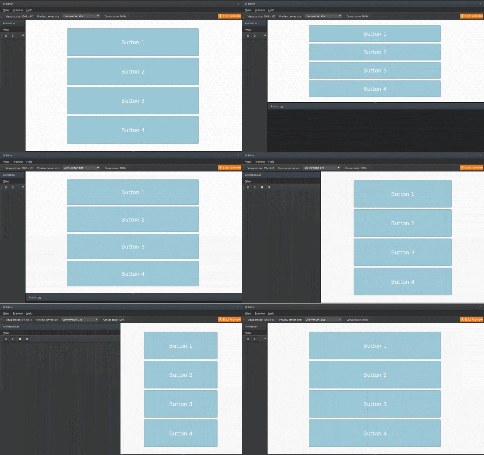
The Scale to Device property helps build game UIs that can display on multiple screen resolutions. You can preview your canvas at different resolutions in the UI Editor in Preview Mode.
A device scale is computed by using the ratio of the authored canvas size to the runtime canvas size. The device scale is then adjusted based on the selected Scale to Device setting. When you select any Scale to Device setting other than None, the device scale is multiplied with the Transform2D component’s Scale property to get the final local scale for the element.
The following Scale to Device settings are available:
| Property | Description |
|---|---|
| None | Does not scale with the device resolution. |
| Scale to fit (uniformly) | Scales to fit while maintaining the aspect ratio. The final device scale for both X and Y is the minimum of the width and height ratios between the authored canvas size to the viewport size. |
| Scale to fill (uniformly) | Scales to fill while maintaining the aspect ratio. The final device scale for both X and Y is the maximum of the width and height ratios between the authored canvas size to the viewport size. |
| Scale to fit X (uniformly) | Scales to fit horizontally while maintaining the aspect ratio. The final device scale for both X and Y is the ratio between the authored canvas width to the viewport width. |
| Scale to fit Y (uniformly) | Scales to fit vertically while maintaining the aspect ratio. The final device scale for both X and Y is the ratio between the authored canvas height to the viewport height. |
| Stretch to fill (non-uniformly) | Stretches to fill horizontally and vertically without maintaining the aspect ratio. The final device scale is the ratio between the authored canvas size to the viewport size. |
| Stretch to fit X (non-uniformly) | Stretches to fit horizontally, but doesn’t stretch vertically. The final device scale for X is the ratio between the authored canvas width to the viewport width. Y doesn’t scale with the device resolution. |
| Stretch to fit Y (non-uniformly) | Stretches to fit vertically, but doesn’t stretch horizontally. The final device scale for Y is the ratio between the authored canvas height to the viewport height. X doesn’t scale with the device resolution. |
When using the Scale to Device setting, note the following:
- Scaling is performed about the element’s pivot.
- Scaling an element doesn’t affect the value of its offsets from its anchors.
- The element’s final scale includes any scale inherited from its parents. Set the Scale to Device property on a UI element whose child elements that you also want to scale with the device resolution.
- Setting Scale to Device on a UI element and a descendant element results in double scaling on the descendant element.
- Avoid setting Scale to Device on a UI element that doesn’t have its anchors together. Doing so can result in undesired behavior. This is because the anchors affect the size of the element relative to its parent, and the Scale to Device scale is applied on top of that.
Example
The element’s size matches the viewport’s size if you set the anchors to the following values:
- Left = 0%
- Top = 0%
- Right = 100%
- Bottom = 100%
However, if you then add a scale on top of these anchor values, the element size no longer matches the viewport size.
Scale to Device Examples
Each of the following examples demonstrates a different Scale to Device setting.
In each example, the background image covers the whole screen and uses the following settings:
- Anchors (apart): Left = 0%, Top = 0%, Right = 100%, Bottom = 100%
- Image type: Tiled
- Scale to Device: None
Uniform Scaling
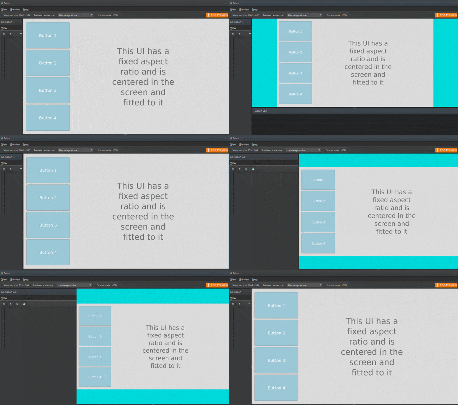
In this uniform scaling example, the UI parent element has a fixed aspect ratio and is centered and fitted to the screen that it’s displayed on.
The background image is a texture with simple settings.
The elements that make up the UI are all contained in a parent element and has the following settings.
Parent UI element settings
| Property | Values |
|---|---|
| Anchor | Left = 50%, Top = 50%, Right = 50%, Bottom = 50% |
| Pivot | Default settings: X = 0.5, Y = 0.5 |
| Width and Height | Matches the authored canvas size (for example, 1280x720) |
| Scale to device | Scale to fit (uniformly) |
Scale to Fit Y
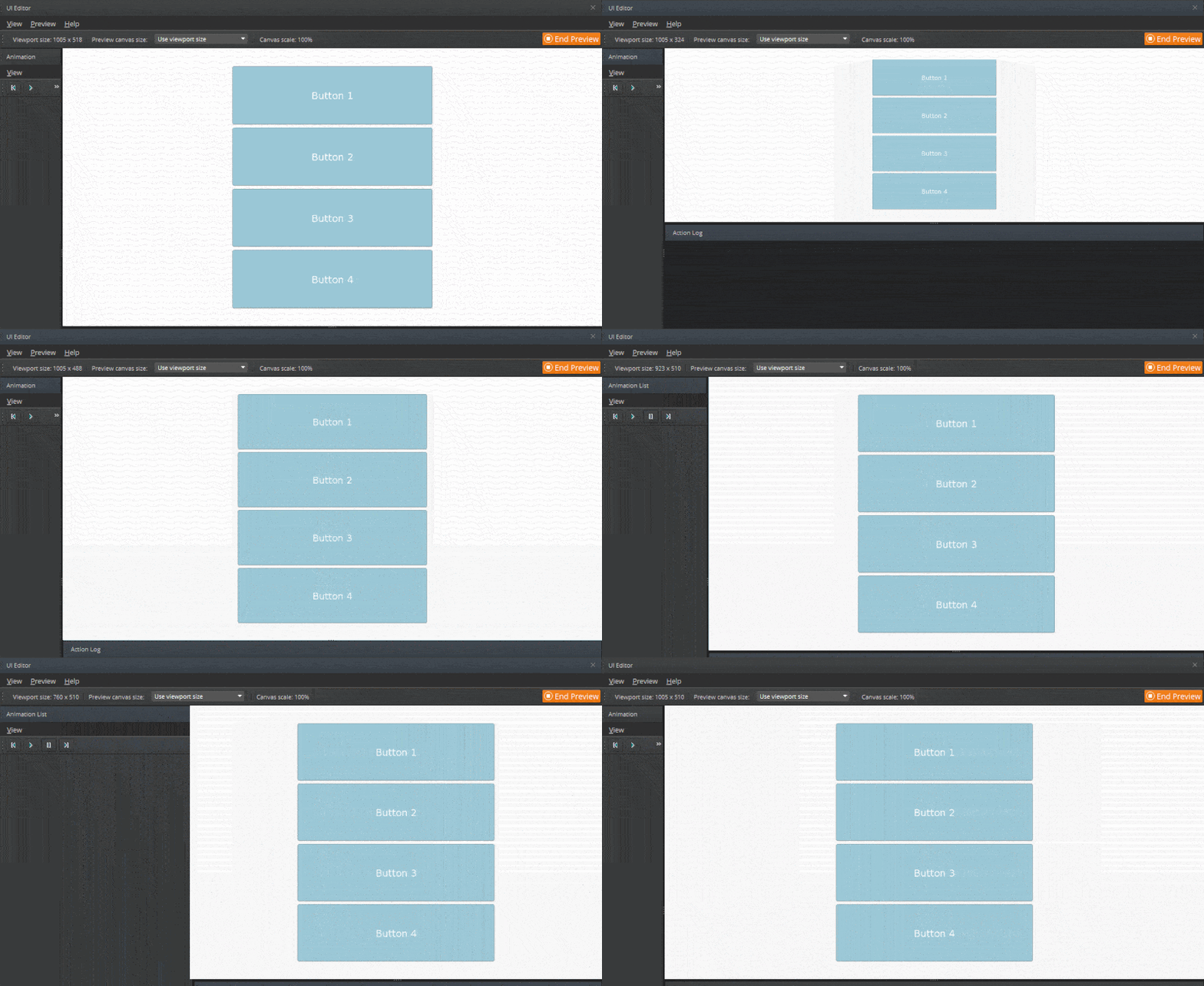
In this uniform scale to fit Y example, the layout column and its buttons are uniformly scaled so that they fit vertically on the screen regardless of its resolution.
The background image is a texture with simple settings.
The elements that make up the buttons are contained in a layout column element. The layout column element contains the UI buttons and has the following settings.
Layout Column element settings for uniform scaling to fit Y
| Property | Values |
|---|---|
| Anchors | Left = 50%, Top = 50%, Right = 50%, Bottom = 50% |
| Pivot | Default settings: X = 0.5, Y = 0.5 |
| Scale to device | Scale to fit Y (uniformly) |
Uniform Scaling While Maintaining Relative Position
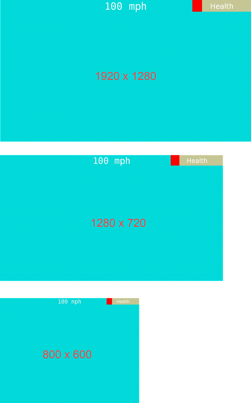
In this example, the Scale to Device setting scales the health bar and speed indicator depending on the screen resolution. Anchor settings maintain their positions so that the health bar always appears in the right corner and the speed indicator always appears in the center.
The background image is a texture with simple settings.
The health bar element has the following settings. The anchor values keep it on the upper right corner of the screen.
Health bar element settings
| Property | Values |
|---|---|
| Anchors | Left = 100%, Top = 0%, Right = 100%, Bottom = 0% |
| Pivot | X = 1.0, Y = 0.0 |
| Scale to device | Scale to fit (uniformly) |
The speed indicator element has the following settings. The anchor values keep it in the top center of the screen.
Health bar element settings
| Property | Values |
|---|---|
| Anchors | Left = 50%, Top = 0%, Right = 50%, Bottom = 0% |
| Pivot | X = 0.5, Y = 0.0 |
| Scale to device | Scale to fit (uniformly) |
The following images show how the health bar and speed indicator scales based on the screen resolution while maintaining their position on the screen.
Note:The indicated resolutions are not shown to scale.
