IN THIS ARTICLE
O3DE UI Browse Edit Component
The browse edit component is one of several types of input boxes offered by the Qt and O3DE UI libraries. Use the browse edit component to enable users to choose one or more values from a selection window. Typical uses include selecting a file from a directory, or one or more items from a list - for example: choosing motions from a collection of animation assets. The selection window is opened using either a button along the right edge, or a double-click in the input box. Chosen values can be cleared using the clear button, if this button has been enabled.
Note:Use a dropdown combo box instead if there is a predefined list of items to select, and a user only needs to select one value from the list.
Anatomy of the browse edit widget
Browse edit widgets have several customization options. Standard features including the following elements:

Label
While not technically part of the widget, you should give input boxes a label in the UI layout.
Placeholder text
(Optional) Hint text that you set using
setPlaceholderText()appears here when the widget text is empty.Input box
Text that you set using
setText()appears here. Users can double-click here to open the selection window that you have connected to theBrowseEdit::attachedButtonTriggeredsignal. Single click actions do nothing here, unless the read-only attribute has not been set totrue.Note:Generally when using the browse edit component, you set the input box to be read only. If you want to allow users to edit the value directly from the input box, use the line edit component instead, with a detached button next to it.Attached button
(Optional) The browse edit input box has an attached button. The default button uses a folder icon, but you can specify a different icon. To specify what happens when users press the button, connect to the
BrowseEdit::attachedButtonTriggeredsignal.Note:When using a custom icon not provided by O3DE, the icon should be a multiple of 16 x 16 and should only be in SVG format.Tooltip
(Optional) If you set tooltip text for the widget, it will appear near where the user hovers.

Clear button
(Optional) If you enable the clear button for the widget, it will appear when the input box is not empty. When users choose the clear button, the input box returns to an empty value.

Error state indicator
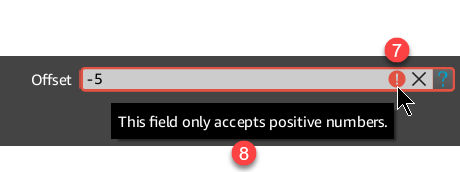
(Optional) If you set a validator for the input box, and validation fails, an error state indicator icon appears at the end of the input box, before the clear button.
Error tooltip
(Optional) When an error state exists, if an error tooltip has been set for the widget, it will appear near where the user hovers. This tooltip appears in place of the normal tooltip text while an error state exists. If you set a validator for the input box, it is highly recommended that you also set an error tooltip.
Basic browse edit

A simple example of this component includes the browse edit widget and an attached button handler. In this example, we enable the user to pick a file from the file browser, and have chosen to enable the clear button.
Example
#include <AzQtComponents/Components/Widgets/BrowseEdit.h>
#include <QFileDialog>

// Create a new browse edit widget.
AzQtComponents::BrowseEdit* browseEdit = new AzQtComponents::BrowseEdit(parent);

// Enable the clear button.
browseEdit->setClearButtonEnabled(true);

// Require users to use the attached button or double-click the input box to open the selection window.
browseEdit->setLineEditReadOnly(true);

// Connect the attached button to the QFileDialog function.
connect(browseEdit, &AzQtComponents::BrowseEdit::attachedButtonTriggered, this, [this]() {
    QString file = QFileDialog::getOpenFileName(this, "Select a file asset");
    if (!file.isEmpty())
    {
        QFileInfo fileName(file);
        browseEdit->setText(fileName.fileName());
    }
});

// Then add browseEdit to a UI layout as needed.
Browse edit with custom icon and placeholder text
![]()
The following example shows how to replace the default button icon with your own, and how to add placeholder text that appears when the value is empty.
Note:When using a custom icon not provided by O3DE, the icon should be a multiple of 16 x 16 and should only be in SVG format.
Example
#include <AzQtComponents/Components/Widgets/BrowseEdit.h>
#include <QInputDialog>

// Set a custom attached button icon.
QIcon icon(":/stylesheet/img/help.svg");
browseEdit->setAttachedButtonIcon(icon);

// Require users to use the attached button or double-click the input box to open the selection window.
browseEdit->setLineEditReadOnly(true);

// Set the placeholder text.
browseEdit->setPlaceholderText("Enter an offset value");

// Connect the attached button to the QInputDialog function.
connect(browseEdit, &AzQtComponents::BrowseEdit::attachedButtonTriggered, this, [this]() {
    QString text = QInputDialog::getText(this, "Offset", "Enter an offset value");
    if (!text.isEmpty())
    {
        browseEdit->setText(text);
    }
});
Browse edit with tooltips and validator

In the following example, both a standard tooltip and an error tooltip have been defined. The standard tooltip appears when a mouse hovers over the widget. The error tooltip appears when a mouse hovers over the widget while an error state exists.
Error states occur when a validator has been set and its validation has failed.
Example
#include <AzQtComponents/Components/Widgets/BrowseEdit.h>
#include <QInputDialog>
#include <QRegExpValidator>

// Set a custom attached button icon.
QIcon icon(":/stylesheet/img/help.svg");
browseEdit->setAttachedButtonIcon(icon);

// Enable the clear button.
browseEdit->setClearButtonEnabled(true);

// Require users to use the attached button or double-click the input box to open the selection window.
browseEdit->setLineEditReadOnly(true);

// Set the placeholder text.
browseEdit->setPlaceholderText("Enter an integer between 0 and 9999");

// Define and set the validator.
QRegExp intRangeExp("[0-9]\\d{0,3}$");
browseEdit->setValidator(new QRegExpValidator(intRangeExp, 0));

// Set the tooltip text.
browseEdit->setToolTip("Enter an offset value using the button.");
browseEdit->setErrorToolTip("Acceptable values are integers between 0 and 9999.");

// Connect the attached button to the QInputDialog function.
connect(browseEdit, &AzQtComponents::BrowseEdit::attachedButtonTriggered, this, [this]() {
    QString text = QInputDialog::getText(this, "Offset", "Enter an integer between 0 and 9999");
    if (!text.isEmpty())
    {
        browseEdit->setText(text);
    }
});
Disabled browse edit

In the following example, the widget and its features have been disabled in code.
Example
#include <AzQtComponents/Components/Widgets/BrowseEdit.h>

// Disable the widget.
browseEdit->setEnabled(false);
C++ API reference
For details on the browse edit API, see the following topic in the O3DE UI Extensions C++ API Reference:
Related links
For components related to the browse edit component, see the following topics:
