IN THIS ARTICLE
O3DE UI Filtered Search Widget
Use the filtered search widget to give users advanced search options in your O3DE UI tools. You can see this interface in action in O3DE tools such as the Entity Outliner and Asset Browser. To quickly narrow their search to the results that they’re looking for, users can select one or more “type filters” to apply to the search terms that they type in the search field.
Anatomy of the filtered search widget
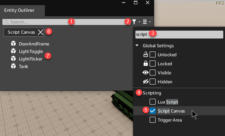
Entity Outliner in the O3DE Editor uses multiple filter categories in a filtered search widget to help users find an entity with specific components or settings. In the following example, we’re looking for all entities with Script Canvas components.

Search field
Users enter search terms here. In the Entity Outliner, they can enter entity names. For example, in the previous image they might enter the term
Lightto start looking for all entities that have the word “light” in their name.Filter menu button
(Optional) Add one or more type filters to your filtered search widget to show the filter menu button. When users select this button, the filter menu opens.
Filter type search field
Users can enter text in this field to narrow the list of filter types shown in the filter menu.
Filter type category
When adding filter types using the
AddTypeFilterfunction, you can specify a category for grouping filter types.Filter type
Users can select one or more filter types to narrow the search results to show only the results that match the types selected from the filter menu. You can add filter types, along with a filter type category, using the
AddTypeFilterfunction.Applied filters
By default, any filters that users select from the filter menu will appear under the search field. You can turn this off by calling
setEnabledFiltersVisible(false)on your filtered search widget.You can also add an icon in front of the name of the applied filter. See how to do this in the filtered type icon example.
Search results
Show the search results below the search field.
Basic filtered search

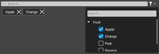
The following example demonstrates how to create a simple filtered search widget.
Example
#include <AzQtComponents/Components/FilteredSearchWidget.h>

// Create a filtered search widget.
auto filteredSearchWidget = new AzQtComponents::FilteredSearchWidget(parent);

// Add a filter type category and filter types.
const QStringList filterTypes = { "Apple", "Orange", "Pear", "Banana" };
const QString filterCategory = "Fruit";
for (const auto& filterType : filterTypes)
{
    filteredSearchWidget->AddTypeFilter(filterCategory, filterType);
}

// Connect the TextFilterChanged signal to a QSortFilterProxyModel.
MyProxyModel proxyModel;
connect(filteredSearchWidget, &AzQtComponents::FilteredSearchWidget::TextFilterChanged,
        proxyModel, static_cast<void (QSortFilterProxyModel::*)(const QString&)>(&MyProxyModel::setFilterRegExp));

// Connect the TypeFilterChanged signal to a proxy model that has a slot that can
// handle changes of the type:
// FilteredSearchWidget::TypeFilterChanged(const SearchTypeFilterList& activeTypeFilters)
connect(filteredSearchWidget, &AzQtComponents::FilteredSearchWidget::TypeFilterChanged,
        proxyModel, &MyProxyModel::ApplyTypeFilters);
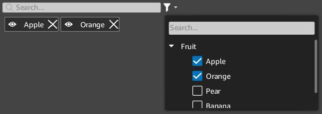
Filtered search with filter type icons
![]()
Add optional icons to your filter types using the extraIconFilename property of the AzQtComponents::SearchTypeFilter.
Example
#include <AzQtComponents/Components/FilteredSearchWidget.h>

// Create a filtered search widget.
auto filteredSearchWidget = new AzQtComponents::FilteredSearchWidget(parent);

// Add a filter type category and filter types.
const QStringList filterTypes = { "Apple", "Orange", "Pear", "Banana" };
const QString filterCategory = "Fruit";
for (const auto& filterType : filterTypes)
{
    AzQtComponents::SearchTypeFilter filterWithIcon(filterCategory, filterType);
    filterWithIcon.extraIconFilename = ":/stylesheet/img/tag_visibility_on.svg";
    filteredSearchWidget->AddTypeFilter(filterWithIcon);
}
Limiting the width of the search field

Use setTextFilterFillsWidth(false) to limit the width of the search field and prevent it from expanding to the full width of the widget.
Example
filteredSearchWidget->setTextFilterFillsWidth(false);
C++ API reference
For details on the filtered search API, see the following topic in the O3DE UI Extensions C++ API Reference:
