IN THIS ARTICLE
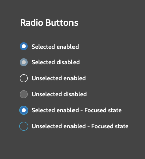
O3DE UI Radio Button Styles
Use radio buttons to enable users to select from two or more options, when users must select exactly one choice. Choosing a radio button deselects the previously selected button.

Usage guidelines
Follow these guidelines as you design your UI with radio buttons:
Use radio buttons when you have two or more mutually exclusive options.
Ensure that clicking or tapping the label selects the radio button.
One radio button should always be selected by default.
Keep radio buttons from the same radio group in close proximity.
Avoid these design choices when using radio buttons:
- Don’t order radio buttons horizontally.
- Don’t trigger an event upon selection of a radio button, such as spawning a popover, popup, new page, or new window.
Basic radio button

Set up and control radio buttons in Qt Designer or in code.
Radio buttons that belong to the same parent will automatically be part of an exclusive group. You can create your own groups too, using a QButtonGroup.
Example
#include <QRadioButton>
#include <QButtonGroup>

QRadioButton* radioButton1 = new QRadioButton(parent);
QRadioButton* radioButton2 = new QRadioButton(parent);

// Create a mutually exclusive group.
QButtonGroup* buttonGroup = new QButtonGroup(this);
buttonGroup->addButton(radioButton1);
buttonGroup->addButton(radioButton2);

// To set a radio button to the selected state:
radioButton1->setChecked(true);

// To disable a radio button:
radioButton1->setEnabled(false);
C++ API reference
For details on the radio button API, see the following topic in the O3DE UI Extensions C++ API Reference:
Relevant Qt documentation includes the following topics:
